Test your website on different devices with emulated presets.
Proxy QA Browser opens your own site in a desktop browser with a phone, tablet or desktop preset applied, in an isolated temporary profile. Every launch records a screenshot and the HTTP status, plus every network request while the network inspector is on (the default).
What emulation applies
Each session gets its own browser context with the preset's viewport, device scale factor, touch support and screen size, isMobile for phones and tablets, and the profile's locale and timezone. Phone and tablet presets send the device's user agent unless you type a user agent on the profile. Device emulation is for layout and behaviour testing of your own pages. It is not designed to disguise the browser from bot detection.
- A custom viewport per profile, from 320 × 320 to 7680 × 4320 px
- One line under the device field names the user agent the device sends, with a Copy user agent button
Phone, tablet and desktop presets
The catalog holds 226 presets: older and current iPhone, Pixel and Galaxy phones, OnePlus, Xiaomi and Motorola models, iPad, Galaxy Tab and other tablets, and Windows, macOS, Linux and Chromebook desktops. Discontinued devices carry a Legacy badge and stay hidden unless Show legacy is on. See device preset types and examples.
Find a device fast
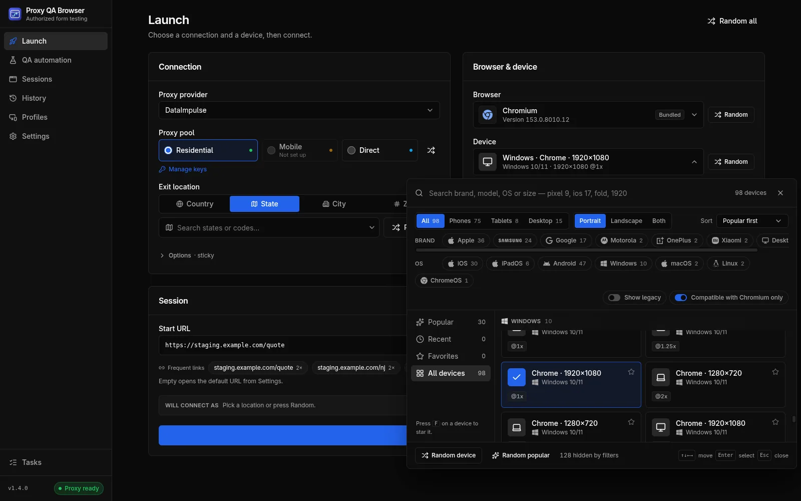
The device field opens a large picker. Search by brand, model, OS or size, such as "pixel 9", "ios 17", "fold" or "1920", and narrow the grid with filters.
- Type, brand, OS and orientation filters, with sorting by popularity, newest, name or screen size
- Popular, Recent (your last 8) and Favorites lists, with a star to add a favorite
- Compatible with the selected browser only, on by default
- Keyboard control: arrow keys move, Enter selects and F stars the focused device
Which browsers can emulate which devices
Phone and tablet presets work on WebKit and every Chromium-family browser, bundled or installed, but never on Firefox. Most desktop presets work on every engine; the macOS Safari (WebKit) preset works only on WebKit and the Windows Firefox preset only on Firefox. Browsers that cannot emulate the chosen device are greyed out with the reason.
Emulation, not physical devices
Emulation is good for layout, breakpoints, touch and user-agent-dependent behaviour on your own pages. It runs inside desktop browsers on your computer: it is not a cloud of physical devices, and an iPhone preset on WebKit is still not Apple Safari.
Repeat across devices
In QA automation, one recorded scenario runs on up to 20 devices in a matrix, capped at 100 cases per matrix by default (configurable up to 500), with step screenshots, checks and JSON, JUnit or HTML reports. Run it against your own staging site with synthetic data.
Small screens and consent disclosures
Small screens are where a disclosure gets covered by a sticky button or shrinks below your minimum font size. The consent checks report both; see consent disclosures on small screens.
Combine with a location and a browser
Pair a preset with a checked exit location from your own proxy plan to see what phone visitors in a US state get. To compare engines, see which browsers can emulate phones and how to add the ones you are missing.
How it works.
Every step and setting is covered in the documentation linked below.
Read the docsChoose a browser
On the Launch page, pick bundled Chromium or WebKit, or an installed Chromium-family browser, for phone and tablet presets.
Pick a device preset
Open the device picker, search or filter, and choose a phone, tablet or desktop preset. The line under it names the user agent the device sends.
Adjust the profile if needed
To set a locale, a timezone or a custom viewport, edit a saved profile on the Profiles page and start it with Launch Browser. Save as profile on the Launch page keeps a launch as a profile.
Connect and launch
Click Connect & Launch with Direct or your own proxy pool. The browser opens at your start URL with the preset applied.
Review and repeat
Check the screenshot and requests under History, then run the same flow on many devices as a QA automation matrix.
Common questions.
Does it test on physical phones and tablets?
No. It emulates phone, tablet and desktop presets inside desktop browsers on your computer: viewport, scale factor, touch support and user agent. It is not a cloud of physical devices. How emulation is applied
How can I test my website on an iPhone without an iPhone?
Pick an iPhone preset and run it on WebKit, the engine Safari is built on, or on a Chromium-family browser. You get the iPhone's viewport, scale factor, touch support and user agent for layout checks, but not a physical iPhone, and WebKit is not Apple Safari. Browser compatibility
Why can't Firefox emulate phones or tablets?
Playwright Firefox does not support mobile emulation, so Firefox is greyed out in the browser list when a phone or tablet preset is chosen. Use WebKit or a Chromium-family browser for them; Firefox still runs most desktop presets. Browser limitations
Can I set a custom viewport?
Yes. In the profile editor, set a viewport width and height from 320 × 320 to 7680 × 4320 px. A custom viewport stops the preset's physical screen size from being reported. Profiles
Which user agent does the browser send?
A user agent typed on the profile always wins. Otherwise phone and tablet presets send the device's user agent, and desktop presets set their Chrome user agent only on the bundled Chromium. Firefox, WebKit and installed browsers keep their own user agent, so Brave reports as Brave.
Try it on your own site.
Free and open source, for Windows, Linux and macOS. Use it on sites you own or are contracted to test.